Here’s how you should design your SSRS of Power BI dashboard (thanks to Julie Koesmarno).
More info on her blog:
http://www.mssqlgirl.com/power-bi-in-a-jiffy-composition-in-power-view.html
To my delight, she mentioned about composition, in particular Fibonacci Spiral. It reminded me of one of the fundamental things that I have learned in photography (as a hobby). So this weekend, I spent a bit of time reviewing some of the data visualisations in Power View that I have created in the past. Instead of just looking at it as just data and information, I put my “amateur” photographer eyes on this. I begin thinking about design, technical and most importantly business components and how to put them together.
Here are a couple of Before-And-Afters, where I have revisited the objectives and composition aspects of these data visualisations in Power View.
Before and After
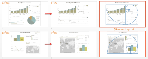
Fibonacci spiral is a pretty cool thing to use / apply in composition…
Ursprünglichen Post anzeigen 44 weitere Wörter

Hinterlasse einen Kommentar