
Very good
Click Here to download this Tutorial file
Very often our analysis starts with a flat data set that contains all of the pertinent columns in a single table that looks like the one above.
As we can see, we can analyze this data using three different lenses or dimensions:
- Product
- Geography
- Date
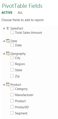
Unfortunately, if we create a Pivot Table on top of that data set, the end result does not look particular user friendly as it essentially presents us with a flat list of all fields available for pivoting:
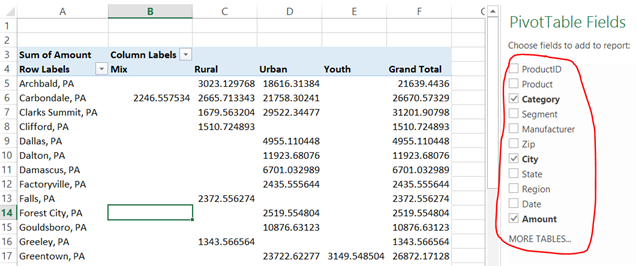
In this tutorial, we will learn how to massage the data using Power Query so that we can build a more user friendly model that looks like this:
Step 1 – Data preparation
The first thing to do is to load our data set into a Power Query environment so we can start massaging it. In our case, the dataset is…
Ursprünglichen Post anzeigen 911 weitere Wörter

Hinterlasse einen Kommentar